
A Complete Vue 3 Setup — Part I

Hey, do you have a moment to talk about the new Tekpix?
Joking aside, I’d like to talk a little about the “new” Vue3 — “new” in quotes — because the update to this beloved framework for Frontend developers has been dragging on since 2020, but after December 2022, when the development team announced it would stop supporting version 2, that’s when it actually became a reality.
Since it’s such a recent version, it’s a bit harder to find complete resources about features, patterns, and libraries.
At this very moment, the biggest Material library for Vue just came out of beta, and they haven’t even released a functional data-table yet.
So I decided to put together a complete setup using Vue3 and a few cositas más (extra bits), to help out my fellow devs.
Quick summary of what’s coming up next…
In this post, we’ll build a reusable component structure based on quasar (the best-structured Material library for Vue3 so far), using Vite to create our project and GitHub Packages to distribute our library.
Besides that, we’ll also create a Scaffolding, a base structure meant to define some patterns and development best practices.
Reusable components
It’s no secret that in many companies — whether because delivery speed is prioritized or because of the technical level of their developers — Frontend applications often evolve in a disorganized, non-reusable way. This can become a serious problem as the product grows, especially for whoever has to maintain and scale it.
So let’s show, in a simple way, how to create a repository/library to provide our components.
Let’s start by creating a project with Vite!
yarn create vite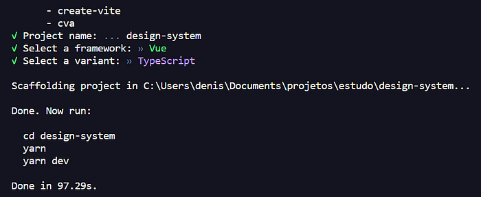
In our case we chose to work with Typescript, but you can opt for Javascript if you prefer.
Right after creating it, we’ll go into the project folder, install the dependencies, and run our project.
cd design-system
yarn
yarn dev
Once that’s done, you’ll have an app running on localhost similar to this one:
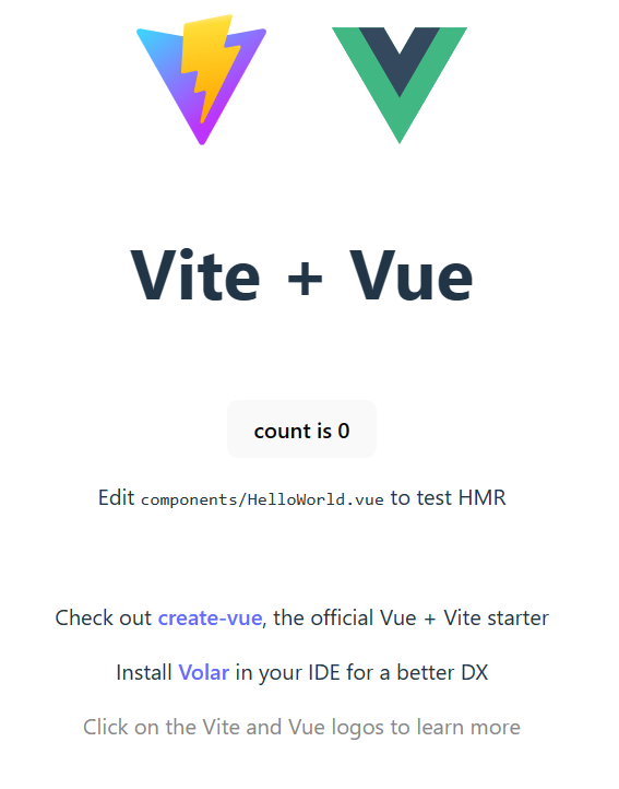
With the project created, it’s time to install a few tools that will help us build our Design System. The first one will be quasar, the Material library that will help us save time developing components.
Note: As we can see in the image above, it’s recommended to have the Volar and TS Volar extensions in your VSCode. (Yes, Vetur is a thing of the past)
Installing quasar
yarn add quasar @quasar/extras
yarn add -D @quasar/vite-plugin sass@1.32.12
These commands are for manually installing quasar; since we’re using Vite to start the project, they’re necessary.
You can choose to use quasar-cli to create your structure, but I ran into a lot of problems getting things to work with their pre-built structure.
After running the quasar installation commands, we need to configure our project’s main.ts file.
// src/main.ts
import { createApp } from 'vue'
import { Quasar } from 'quasar'

// Import icon libraries
import '@quasar/extras/roboto-font/roboto-font.css'
import '@quasar/extras/material-icons/material-icons.css'
import '@quasar/extras/material-icons-outlined/material-icons-outlined.css'
import '@quasar/extras/material-icons-round/material-icons-round.css'
import '@quasar/extras/material-icons-sharp/material-icons-sharp.css'
import '@quasar/extras/material-symbols-outlined/material-symbols-outlined.css'
import '@quasar/extras/material-symbols-rounded/material-symbols-rounded.css'
import '@quasar/extras/material-symbols-sharp/material-symbols-sharp.css'
import '@quasar/extras/fontawesome-v6/fontawesome-v6.css'
import '@quasar/extras/themify/themify.css'
import '@quasar/extras/line-awesome/line-awesome.css'

// Import Quasar css
import 'quasar/src/css/index.sass'

// Assumes your root component is App.vue
// and placed in same folder as main.js
import App from './App.vue'

const myApp = createApp(App)

myApp.use(Quasar, {
  plugins: {}, // import Quasar plugins and add here
})

// Assumes you have a <div id="app"></div> in your index.html
myApp.mount('#app')
Not all of these imports are mandatory — it really depends on what you’re going to use.
Now let’s go to our Vite configuration file; you should leave it like the code below:
// vite.config.js
import { defineConfig } from 'vite'
import vue from '@vitejs/plugin-vue'
import { quasar, transformAssetUrls } from '@quasar/vite-plugin'

// https://vitejs.dev/config/
export default defineConfig({
  plugins: [
    vue({
      template: { transformAssetUrls }
    }),
    quasar({
      sassVariables: 'src/quasar-variables.sass'
    })
  ]
})
Notice that we have a src/quasar-variables.sass file being imported in the Vite configuration; our next step will be to create it, since that’s where we’ll configure the variables that control the components’ color palette.
// src/quasar-variables.scss
$primary   : #1976D2
$secondary : #26A69A
$accent    : #9C27B0

$dark      : #1D1D1D

$positive  : #21BA45
$negative  : #C10015
$info      : #31CCEC
$warning   : #F2C037
Now that we have quasar installed, we can run a quick test by instantiating any component in our template — you’ll see that everything is working as expected.
Also, at this point, you can delete the HelloWorld component along with the css, images, and assets created in Vite’s default project — give the structure a good cleanup, since we’ll be creating our own components.
But first, let’s install Storybook. For those who’ve never used it, it’s a very powerful tool that lets us view our components in real time, letting us change their props and observe their behavior without actually having to install our library in a real application — it’s a huge help when documenting components.
Installing Storybook
Installing Storybook is always an adventure of its own; it depends a lot on which libraries and technology (Angular, React, Vue, Svelte, etc.) you’re using, and the versions of Node and Storybook itself that you chose also affect the process. So you may well run into problems that I won’t cover here.
My tip in these cases is: don’t give up. Like everything in our beloved field of technology, someone has already been through this struggle before — as master Yoda would say, “If search you desire, find it you will!”
npx storybook initAfter installing it, you need to configure quasar to work together with Storybook.
Inside the project, a .storybook folder was created; in it you’ll find a preview.js or .cjs file — leave it like this:
// .storybook/preview.js
import '@quasar/extras/roboto-font/roboto-font.css';
// These are optional
import '@quasar/extras/material-icons/material-icons.css';
import '@quasar/extras/animate/fadeInUp.css';
import '@quasar/extras/animate/fadeOutDown.css';
import '@quasar/extras/animate/fadeInRight.css';
import '@quasar/extras/animate/fadeOutRight.css';
import { Notify } from "quasar";

// Loads the quasar styles and registers quasar functionality with storybook
import 'quasar/dist/quasar.css';
import { setup } from '@storybook/vue3';
import { Quasar } from 'quasar';

setup((app) => {
  app.use(Quasar, {
    plugins: {
      Notify,
    }, // import Quasar plugins and add here
    config: {
      brand: {
        primary: '#1976d2',
        secondary: '#26A69A',
        accent: '#9C27B0',
        dark: '#1d1d1d',
        'dark-page': '#121212',
        positive: '#21BA45',
        negative: '#C10015',
        info: '#31CCEC',
        warning: '#F2C037'
      }
    }
  });
});

export const parameters = {
  actions: { argTypesRegex: '^on[A-Z].*' },
  controls: {
    matchers: {
      color: /(background|color)$/i,
      date: /Date$/,
    },
  },
};
Also, if you want to set up a custom theme, you can create these files:
// .storybook/manager.js
import { addons } from '@storybook/addons';
import theme from './theme';

addons.setConfig({
  theme: theme,
});

// .storybook/theme.js
import { create } from '@storybook/theming';

export default create({
  base: 'light',
  brandTitle: 'Design System Components',
  brandUrl: 'URL_REPOSITORIO',
  brandImage: 'URL_LOGO_EMPRESA',
});
Now you can create your “.stories.js” files, importing the components and documenting their props and events. I won’t go into much detail about how to use Storybook — the concept to keep in mind is how Storybook works, so it’s worth reading their docs on writing Stories.
Now that we have Storybook installed and ready to receive our components, I’ll create a basic button component with quasar+Vue3 and a Storybook file as an example.
Inside the components folder, I’ll create a buttons folder, and inside the buttons folder, I’ll create a QcButton.vue file.
<template>
  <div class="QcButton__wrapper">
    <q-btn
      :color="color"
      :label="label"
      :icon="icon"
      :outline="outline"
      :round="round"
      :size="size"
      :loading="loading"
      :flat="flat"
      :type="type"
    >
      <template v-slot:loading>
        <q-spinner-facebook />
      </template>
    </q-btn>
  </div>
</template>

<script setup lang="ts">
export interface QcButtonInterface {
  color?: string;
  label?: string;
  outline?: boolean;
  icon?: string;
  round?: boolean;
  size?: string;
  loading?: boolean;
  flat?: boolean;
  type?: string;
}
const props = withDefaults(defineProps<QcButtonInterface>(), {
  color: 'primary',
  label: 'Label',
  outline: false,
  round: false,
  size: 'lg',
  loading: false,
  flat: false,
});
</script>

<style lang="scss" scoped></style>
Notice that I’m using Vue3’s composition API and Typescript interfaces, in addition to the <q-btn>, which is a quasar component.
Nothing stops you from creating the button however you find most convenient.
Now, in the same button folder, I’ll create the QcButton.stories.js file. It’s important that Storybook’s configuration is set up to look inside your project folder, since the default setup keeps .stories.js files inside a stories folder that’s automatically created by the library.
If that’s not the case, you can fix it in the .storybook/main.js file.
// .storybook/main.js
module.exports = {
  "stories": ["../src/**/*.mdx", "../src/**/*.stories.@(js|jsx|ts|tsx)"],
  ... // rest of the file
}
Now let’s go to our QcButton.stories.js file:
// src/components/buttons/QcButton.stories.js
import QcButton from './QcButton.vue';

export default {
  title: 'Components/Button',
  component: QcButton,
  argTypes: {
    onClick: {},
    size: {
      control: { type: 'select' },
      options: ['xs', 'sm', 'md', 'lg', 'xl'],
    },
    icon: {
      control: { type: 'select' },
      options: ['navigation', 'add_a_photo', 'camera', 'camera_front', 'my_location'],
    },
    color: {
      control: { type: 'select' },
      options: ['primary', 'secondary', 'amber', 'brown-5', 'deep-orange', 'purple', 'black'],
    },
  },
};

const Template = (args) => ({
  components: { QcButton },
  setup() {
    return { args };
  },
  template: '<QcButton v-bind="args" @click.capture="onClick" />',
});

export const Primary = Template.bind({});
Primary.args = {
  label: 'Button',
  loading: false,
  round: false,
  outline: false,
  color: 'primary',
  type: 'submit',
};
Finally, after running the yarn run storybook command, you’ll get something like this:
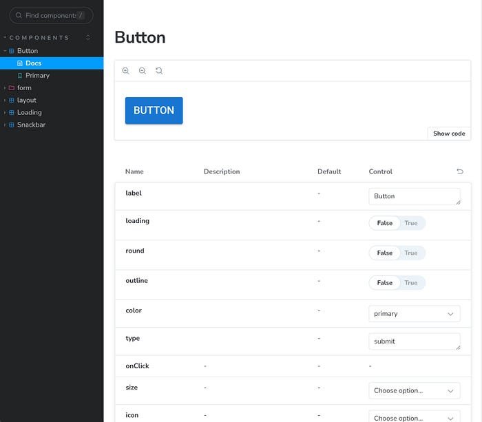
With that, we have our Storybook and our first Vue3 + quasar + Typescript component!
Of course, this is a pretty simple component, and you’re probably wondering: why go through all this trouble just to wrap a quasar component inside another .vue component?
The answer is simple: the way we’re doing it, all the work of building the component is handled by a dev or a team with more technical expertise, encapsulating all the complexity inside that component. For the rest of the squads or tribes, all that’s left is to “copy” and “paste” — just start using a ready-made component, already matching the client’s visual identity.
Besides, a simple button doesn’t show off the full power this concept can offer — imagine a complex data-table, with date formatting, menu actions, and method after method, ready to use instantly, or a text-field with built-in document, value, zip code formatting and validations.
Or maybe a video/image upload component built on top of quasar, with its logic and visual identity fully encapsulated, simply receiving props and emitting events once the process is done. The possibilities are huge!
Well, now that we have a basic structure for our components, it’s time to move our project forward a bit. In the next post we’ll talk a little about unit testing with Jest, and setting up Eslint, Prettier, and Husky. One step at a time — remember that Frontend development isn’t a 100-meter dash, it’s a marathon; consistency matters more than speed, and that’s how we go far!